Where the Eye Lands First: Mapping the Invisible Rules of American Visual Attention
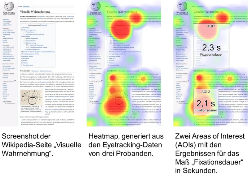
Photo: EYEVIDO, Copyrighted free use, via Wikimedia Commons
Every image on a commercial web page competes in a contest that lasts roughly three seconds. In that window, an American visitor decides whether to look, skim, or scroll past — and eye-tracking research suggests the decision is made well before conscious thought catches up. For creative professionals selecting stock photography, understanding where the eye actually travels is no longer a nice-to-have. It is the difference between an image that works and one that merely exists on the page.
The Anatomy of a Scan
Decades of usability research, from the original F-shaped reading studies conducted by the Nielsen Norman Group onward, have established that Western audiences process screens in predictable patterns. Eyes typically enter at the upper left, sweep across the headline zone, and then drop down the page in an increasingly shallow diagonal. Photography placed inside that first horizontal band receives disproportionate attention; imagery pushed below the fold or into the right rail often goes unseen entirely.
What is less widely understood is how images alter the scan itself. Heatmap studies consistently show that human faces act as gravitational centers. When a stock photo contains a person, viewers' gaze locks onto the face — and, crucially, follows the direction of that person's gaze. A model looking toward your call-to-action pulls attention with her. A model gazing off-frame does the opposite, escorting your reader straight off the page.
Focal Placement Is a Cropping Decision
The practical implication is that composition is not fixed at download. The same licensed image can succeed or fail depending on how it is cropped for its placement.
Consider three rules drawn from attention research:
- Anchor the subject toward the left third. Because American readers enter from the upper left, subjects positioned there are registered faster and held longer.
- Preserve gaze direction toward content. When cropping, never clip the frame so the subject appears to look out of the layout. Leave visual breathing room in the direction the eyes point.
- Guard the faces. Automated center-crop tools routinely decapitate or marginalize the very element — the human face — that commands attention. Treat face position as a hard constraint in any responsive crop.
Why Some Images Get Skipped Instinctively
Just as instructive is what the eye avoids. Heatmaps of cluttered, over-styled, or obviously staged stock compositions show a telltale pattern: gaze slides across them without pausing, a phenomenon researchers describe as banner blindness applied to photography. Viewers have learned, through years of exposure, that certain visual formulas — the airbrushed team high-five, the glossy boardroom grin — signal advertising rather than information. The eye has been trained to deprioritize them.
Images that hold attention share measurable traits: a single dominant subject, genuine-looking expression, and sufficient negative space for overlaid text without visual collision. None of these require exotic sourcing. They require deliberate evaluation at the point of selection.
A Practical Pre-Publication Checklist
Before any stock image goes live, run it through a simple attention audit. View the layout at a glance distance and note what registers first — if it is not the intended message, the composition or crop needs adjustment. Squint at the image: does one focal point survive, or does the frame dissolve into noise? Check the subject's eyeline against the layout's reading flow. And test every responsive breakpoint, because a crop that respects the face on desktop may destroy it on mobile.
The three-second window is unforgiving, but it is not mysterious. The research is settled; the patterns are documented. What remains variable is whether the professionals choosing imagery choose with that science in view — or leave the first three seconds to chance.